24th February 2024
Dear Dhiraagu,
Updating an existing service is a daunting task and I completely understand that.
But, your new customer portal sucks and here’s why:

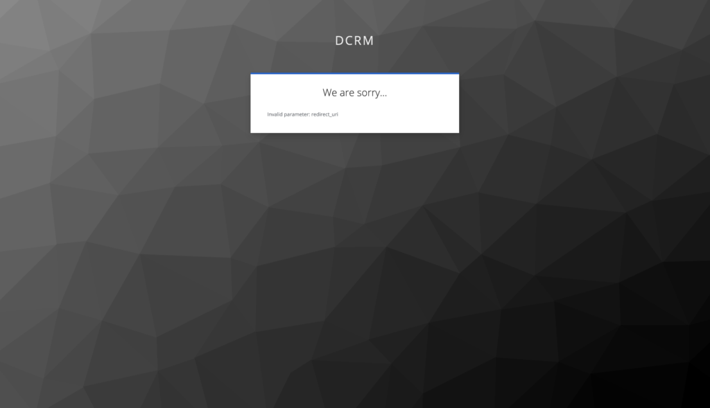
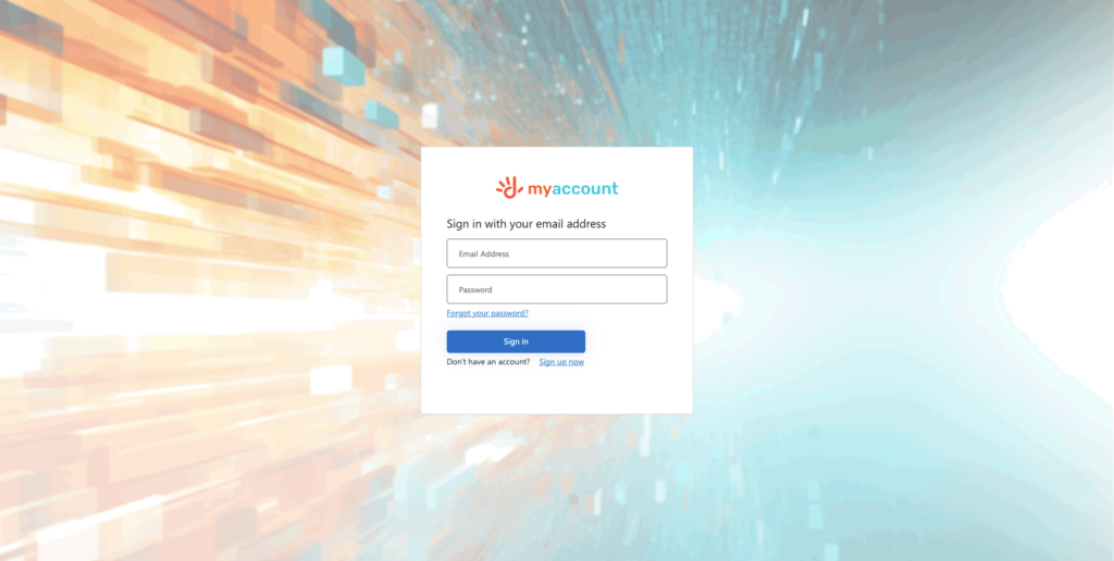
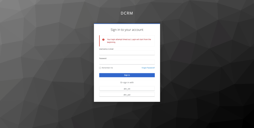
The pixelated background image for the login page
While a pixelated background can be a stylistic choice, it doesn’t seem to be the case here. Dhiraagu has a very concise and clear branding. You see this across all of their digital and printed products. The background image was strange to begin with, but even worse off was the fact that it is pixelated. This makes the product look unfinished and like no thought was put into it.
Suggested Solution
If a product needs to be quickly pushed to production and you do not have the digital assets for it, it's better to just use a solid colour OR use existing assets instead of a pixelated image.

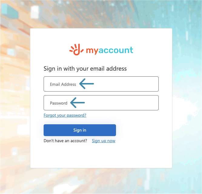
Form fields with no labels
It is bad practice to only use a placeholder for form fields. This is because once a user enters data into the field it becomes an unidentifiable box with data in it. While this may not seem like a huge issue on a login page where you expect an email/username and password, a consistent design system is key to good UI/UX.
Suggested Solution
If you wish to have minimalistic form fields, you can have placeholders that move up once a user clicks on the field. You can see this in Google’s Material Design 2. The other solution would be to simply have a label above the input.

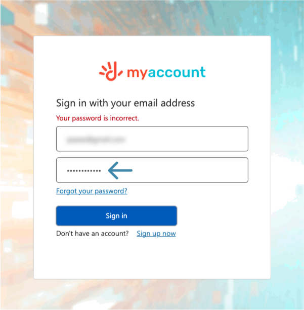
The account’s password needs to be reset, but this is not informed
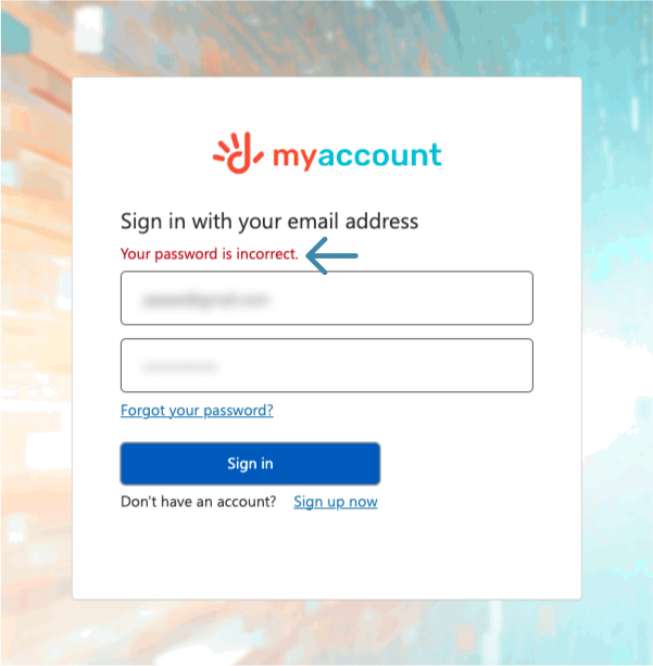
Navigating a new system that has existed for ages is difficult enough. This becomes worse when there is nothing to guide the user regarding the change. The new system requires users to click on ‘forgot your password’ and reset it before the system can be used. This is posted on your social media, but it would be safe to say that a majority of users will not be keeping up with Dhiraagu. The general action that all users would pursue at this point would be to use their existing email and password and get very confused as to why it says password incorrect.
Suggested Solution
Users would always benefit from being guided when it comes to system changes. A small notice that simply mentions ‘Due to Dhiraagu switching over to a new account management system, you will be required to reset your password using Forgot your password? before signing in for the first time’ would help save time and confusion for users who are certain they are using the right credentials.

Inability to view the password
While there are good arguments for why we don’t even need password masking to begin with, it’s worse when the password is masked permanently with no way to see it. This coupled with point 3 makes it so that users may spend time retyping the password thinking they have made a mistake that they can’t verify as they make attempts to log in.
Suggested Solution
Since an unmasked password is not that popular yet, a good solution for now would be to use either text or iconography (Eg: an eye) to allow users to see what they have typed into the password field.

Resetting the password is very confusing
There are several issues with the reset process:
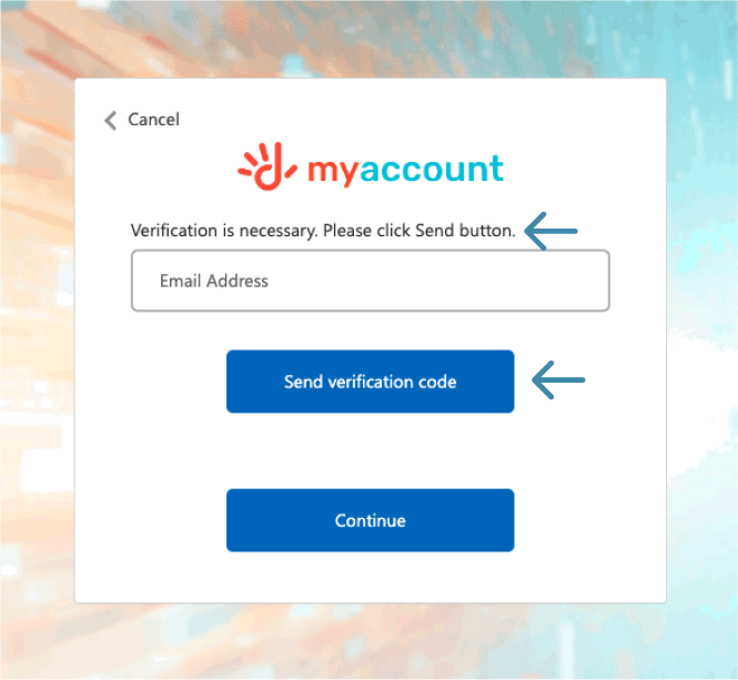
The microcopy that users immediately see is ‘Verification is necessary. Please click Send button.’
- ‘Verification is necessary’ is not a great way to guide a user on what they need to do. It sounds hostile and may leave a user wondering what this was necessary for.
- ‘Please click Send button’ is grammatically wrong and the actual label on the button is ‘Send verification code’.
Suggested Solution
The microcopy could simply be ‘To reset your password, please verify the email associated with your account’.
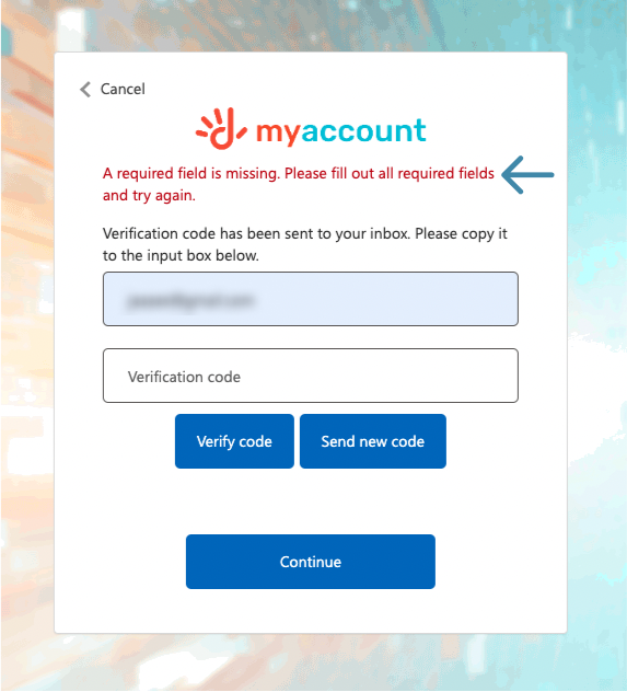
The screen for the verification code has a Continue button. This button does not need to be shown here since the immediate action you require from users is to verify their email address. It is also confusing when there are two primary buttons for a form.
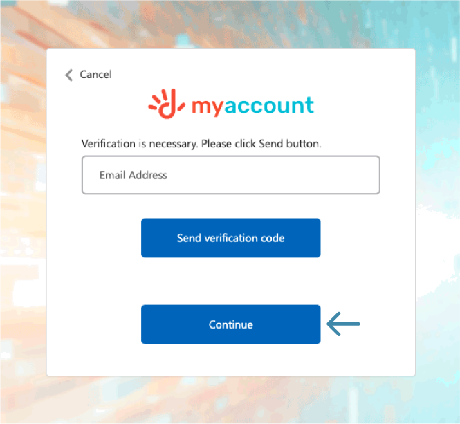
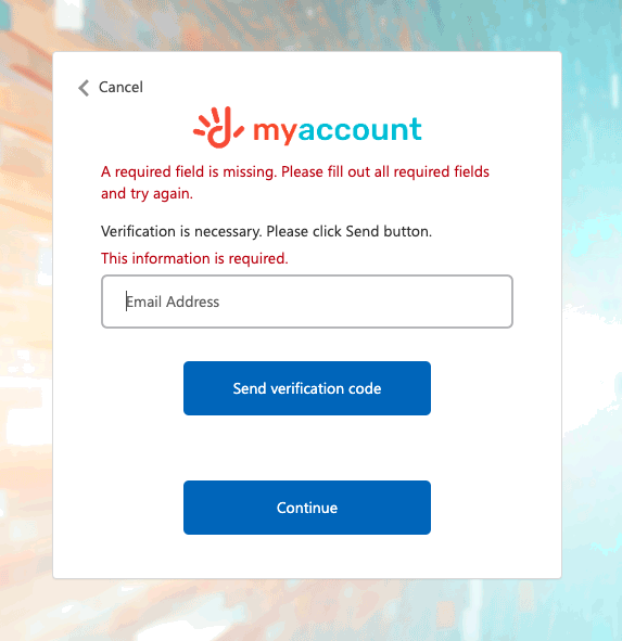
If a user clicks on Continue instead of verifying, it leads to an error message that says 'A required field is missing. Please fill out all required fields and try again'. Once the error message is triggered, it stays visible even when the proper process is followed. Even if I try to reset my password several days later. It's safe to assume that this error message will follow me for the rest of my life.
Suggested Solutions
There is no reason why the continue button should exist at this stage of the password reset process at all and should be removed.
While the suggested solution makes the following suggestions redundant, they would still be useful for an instance where it’s needed:
- If a secondary button needed to be used, it should be visually less eye catching than the primary button.
- Error messages should always be meaningful so that users understand why there is an error and in this case the field does show that the email is missing so two error messages are not necessary. If a field is required, this is generally denoted using an asterisk which is also missing here.
- Error messages caused by a mistake in one screen should never follow a user for the rest of their lives, that's what we have parents for.

Resetting the password is very confusing part 2: the return of bad practices
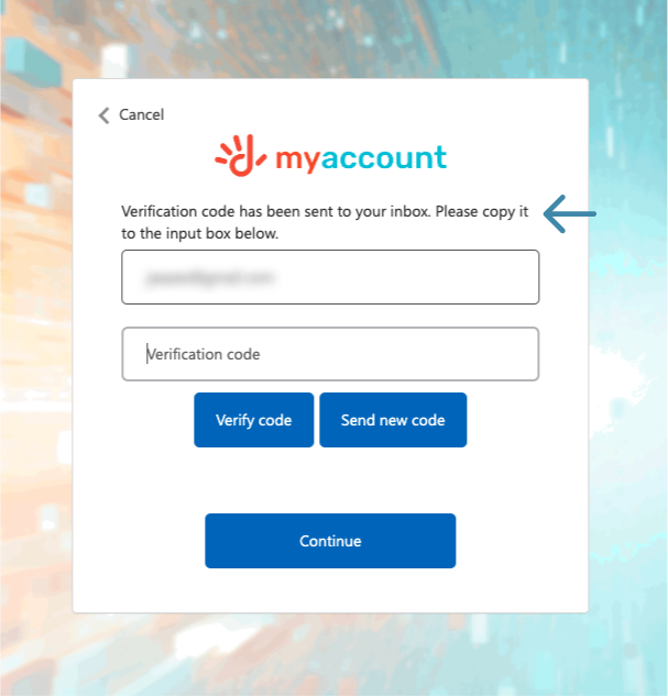
Once the user enters an email and proceeds to the next screen to verify their email, they are met with more confusing instructions, buttons, and error messages.
The microcopy that users see is ‘Verification code has been sent to your inbox. Please copy it to the input box below.’ Using vague terms such as 'input box' is not useful. It is also redundant to ask users to look for something 'below' as there are more effective methods to guide users.
Suggested Solution
A more helpful microcopy would be 'Enter the 6 digit code sent to {email addresss}'.
This alone won't fix this screen and I will address the other major issues.
There is no reason at all why this screen should have the email again as an input field and this is made worse when you click on the field and it takes you back to the previous step to re-enter the email again.
Even if the intention was to allow users to change the email, this is not intuitive since users will press cancel or click back on their browser to head to the previous screen. It is not a natural flow to click an input field to go to a previous step.
Suggested Solution
This field should be removed.
The screen for submitting the verification code also has a Continue button. This button does not need to be shown here since the immediate action you require from users is to put in the verification code. It is also confusing when every button used is a primary button
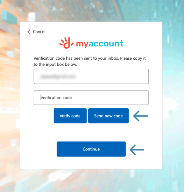
If a user clicks on Continue instead of verifying, it leads to an error message that says ‘Claim not verified: Email address’. Error messages should always be meaningful so that users understand why there is an error. This error message is also triggered for the rest of eternity.
Suggested Solutions
- The continue button is redundant when the actual primary button here is verify code.
- To follow best practices, place the primary button 'Verify Code' to the right and the secondary button 'Send new code' on the left. These should also be visually identifiable.
- If the user clicks on verify while the code input is empty, it should show a more meaningful error message such as ‘Please enter the verification code'.
- Error messages should not stay visible once the problem is resolved.
There is no way for users to know if there is an expiration on the code, if there is a certain amount of time the user needs to wait before they retry getting a code, and if they click on send new code there is no confirmation of it being resent - all things that one would generally expect to see on an OTP screen.
Users can click on verify code 10 times in a row. It's terrible UX since there is no success message and so users may click on 'Send new code' a second time, have a flood of multiple codes, and then be unsure of which one to use.
Suggested Solution
An action like this would benefit from a response. Clicking on 'Send new code' should result in a success message denoting a new code has been emailed.
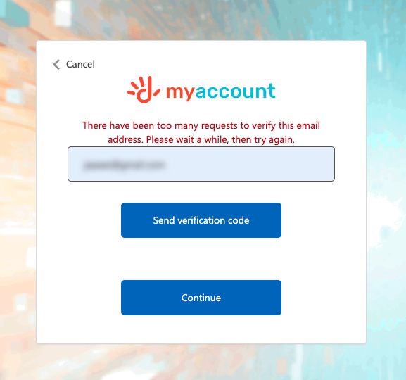
If you attempt getting a new code for the 11th time, you are required to wait before reattempting, but there is no indication of how long a user is required to wait.
The unknown period of time you are expected to wait before retrying is 10 minutes. Since this isn't mentioned, users are expected to periodically keep checking even if they had accidentally exceeded the 10 attempts.
Suggested Solution
While there are better ways to design this entire process, if users are allowed to make multiple attempts in one go, it would be beneficial to show how long they need to wait before reattempting once they are locked out.
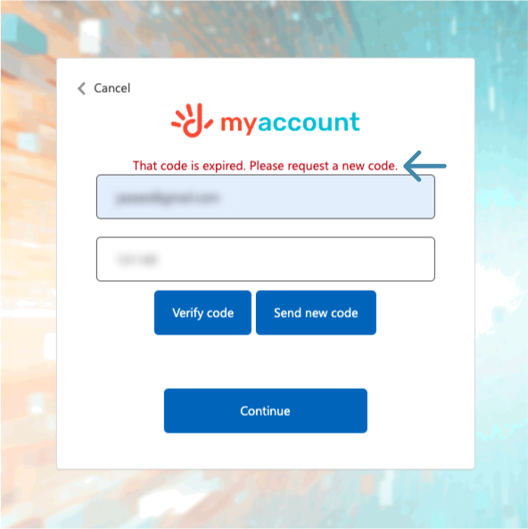
The verification code screen does not show if or when a code that is sent will expire.
The unknown expiration for a code is 5 minutes. Since this isn't mentioned, users are expected to find out their code is expired only when they attempt to use it. This expiration is not mentioned in the email with the code either.
Suggested Solution
Users should be informed when a code will expire either with a countdown on the form itself or in the email where the code is sent.
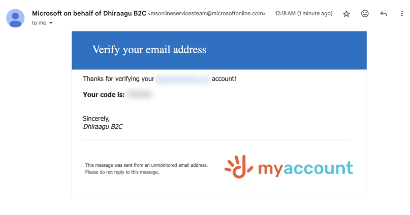
The email content is confusing as well. The header says 'Verify your email' and the body says 'Thanks for verifying your {email} account' making it seem like the verification has already completed.
Suggested Solution
Content should never contradict itself or be framed in an ambiguous way. A better email would be:
Use this code to verify your email:
Code in a much larger legible font
This code will expire in 5 minutes.
Framing the email like this lets the user process crucial information quickly and effectively.
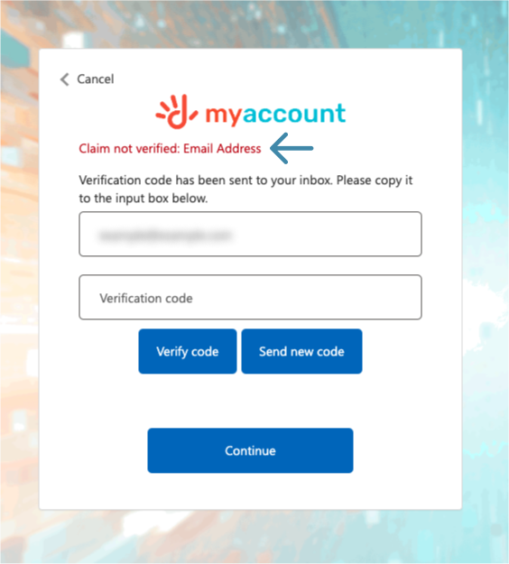
Since the purpose of this screen is to make users verify their email account, it does not need a continue button. If a user clicks on Continue instead of verifying, it leads to an error message that says ‘Claim not verified: Email address’. Error messages should always be meaningful so that users understand why there is an error. This error message is also triggered for the rest of eternity.
Suggested Solution
This continue button is not needed either and error messages should be more meaningful.

The never ending password reset process
Once a user verifies their email to reset their password the next screen they are met with a button that says 'Change e-mail'.
Imagine you went to the doctor and he asks you what the issue was. You point to your broken leg and the doctor says "sure I can fix your leg, but first, would you like for me to check your eyesight?"
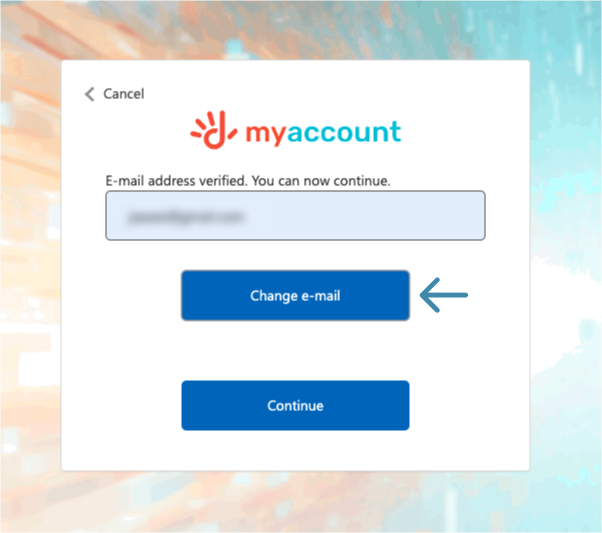
This is not a button a user would intuitively expect. Even if a user had accidentally put in the wrong email, and logged into said email, retrieved the verification code, pasted it into the input field, clicked 'Verify code', and at this point realized this isn't the right email they wanted to reset the password for, they are not going to look for this button and are more likely to go back to the account management homepage.
A button that says 'Change email' seems like what you would use to change the email associated with the account you just verified while you are trying to reset its password.
Suggested Solutions
- When the user verifies their email it should automatically proceed without the user being expected to click continue.
- This screen should not have a button that says change email. If you intend to allow users to start over, a secondary button with 'Cancel' would be more effective.

Users are unable to create a new account
leads to a 500 server error.

If you click the cancel / back button at any point during the login / password reset process, you are flung into deep space
I doubt this screenshot needs any arrows, because this screen should not be accessible by the general public. My login attempt shouldn't have 'failed', I simply clicked 'Cancel' on the previous screen so at worst it should have just taken me to the initial screen.
Suggested Solution
I assume this is a terrible bug so I guess the real solution would be..test your system before release?
At this point, I had not even logged into the system.
Inside the system the payment functions are even worse with confusing buttons, random redirects that show error pages before you're taken to the right page, and so many bugs. The whole process is not intuitive at all and the quality is not befitting a corporation as big and well funded as Dhiraagu.
But that's a story for another day - when I have to pay my bill again and my hatred for the system is renewed once again.

Bonus Point - The system does not let you log out of it
Please, Dhiraagu, let me go.
